
You have finally bought your dream home. Now that you think you might never move again, you have decided it is time to start decorating the way you have always wanted to. You have decided to go either retro or vintage. Now you just have to make up your mind between the two. While you’re thinking about it, remember this one important fact: your paint choices matter.
It is easy to get caught up in vintage or retro design and forget about the paint, even as you’re looking at furniture, knick-knacks, and window treatments. But don’t forget that wall treatments are what tie everything together. You could use paint, whitewash, or even cheesy 1970s wallpaper. If your wall treatment doesn’t fit the era you’re shooting for, everything else will look terribly out of place.
Table of Contents
The Difference Between Vintage and Retro
From a design standpoint, there is a distinct difference between vintage and retro. Vintage pertains to a specific era that is well-defined. For example, the vintage farmhouse is a design style based on late 19th century farmhouses. Deciding to go vintage does not limit you to that particular era. You could choose anything.
Retro is a little bit different. In its purest form, retro is something new that has made to look like something old. You can buy a wall clock manufactured in 2021 but made to look like something manufactured in 1951. That would be a retro clock.
From an interior design standpoint, the one thing both vintage and retro have in common is settling on a particular time frame. Whether you are going for the 1890s or the 1950s, all your design choices will flow from that era. That includes the paint scheme.
Whites and Light Earth Tones
Jami Ray, owner of Lehi, Utah’s Jami Ray Vintage and an expert on vintage farmhouse décor, says whites and light earth tones make up the color palette for vintage farmhouse. That makes sense. Turn-of-the-century farmers didn’t have a lot of money to spend on interior decoration. They painted with whitewash, milk paint, or chalk paint. Most of the hues in their homes were variations of off-whites, creams, and browns.
If you’ve ever wondered why photographs of vintage farmhouse interiors feature so much white, now you know. Whitewashed floors and walls were typical of farmhouses during that era.
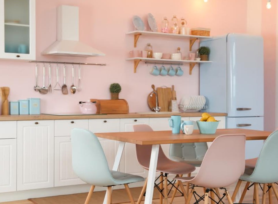
1950s Pastel Turquoise and Pink
Maybe vintage farmhouse isn’t your thing. Instead, you are looking at doing a retro theme that pays homage to the 1950s. Great. Sherwin-Williams says that interior design in the postwar era was a mixture of mid-century modernism and Scandinavian influences.
Pastel colors were the thing back then. Turquoise and pink were favorites for the kitchen, while various shades of yellow, gray, purple, and beige dominated living rooms and bedrooms.
1980s Subtle Primary Colors
Maybe you are young enough that neither vintage farmhouse nor the 1950s appeal. Perhaps the postmodern 1980s is more to your liking. That’s fine. Pastels were big then, too. However, color schemes were generally subtle shades of your three primary colors: red, blue, and yellow.
Brighter primary colors were fine for clothing, appliances, and furniture. But on the walls, you didn’t want to go to bright. Softer shades were a lot more acceptable. If you do decide to go eighties, you can pop a few bright colors with throw pillows and artwork.
Whether you are looking to decorate in a vintage or retro style, remember two things. First is choosing a particular era and staying true to it. Second is to make sure your paint scheme matches the era. Otherwise, everything else will look off.